Latest entries

Tuesday, June 12, 2012

Child's Play

0 comments


Child’s Play 
relives the childhood experience of unfiltered expression through artistic techniques, styles, and content. Using what initially appears to be “bad” painting, the featured artists capitalize on the accessibility and familiarity of elementary art making to address larger personal and social topics. The artists engage in energetic mark making or incorporate juvenile materials to return to past memories and evoke culturally stimulating experiences. The fluidity and freedom afforded by this form of expression helps artists access innate sentiment, ultimately indicative of the artist’s sincere motives. While the exhibited works appear less intellectually refined, their honesty and approachability ultimately elevates them to an even higher level of ingenuity and innovation. 

Children function at the most basic human level, unperturbed by social consequences, judgments, or influences, yet acutely aware of relationships, attitudes, and their environment. They operate based on instinct and innate compulsion without a restricted self-consciousness. They express emotions as they arise and speak candid truths. Psychologically, children nature through various developmental stages beginning with total unconsciousness and resulting in complete, socially informed, awareness. According to Sigmund Freud, children progress from their selfishly disposed ‘id’ to the ‘ego’, a self whose consciousness is grounded in reality, and finally to the ‘superego’, driven by a sense of morality and ethicality. The inherent qualities in children, ones that encourage spontaneity and experimentation, become quelled by social norms and regulations prompting a personal negotiation with society’s pressure to conform—who are you individually and how do you exist in the world.  Through maturity into adulthood, this uninhibited child-like honesty becomes latent; the oppressive impetus of society transforms ingenuity and honest expression into a sense of the “amateur.”

Yet this is not always so. Gaining popularity in the 1980s, the “Bad Painting” movement introduced a style of artwork that fought against high art intellectualism. Art encourages a freedom of expression and should, ‘bad painting’ artists believed, offer the opportunity to reveal one’s inner-self “without any grand attempt to rescue painting or make it noble.” By dismissing cultural barriers and canonical forces, these Bad artists strive to identify a greater self-awareness of internal emotions and larger cultural conditions. While some artists incorporate specific subject matter to access suppressed sentiments in a nostalgic commemoration, others re-appropriate amateur painting techniques to address the innate sensibilities of youthful freedom. While this unique style appears, to the untrained eye, unskilled and careless, it challenges viewers to “reconsider what skills are necessary to make a convincing description of the world.” These artists are radicalizing what we consider “good” or high art. 

Nicola Tyson, Two Figures Touching, 2011
Oil on canvas


Painter James Rielly bewilders viewers by disorienting and distorting expectations of childhood innocence. Painting with a certain level of childish, or untrained technique, Rielly’s paintings exhibit ironies of sexualized desires and “eroticized anxieties.”[1] Hardly overt in representation, Rielly’s paintings reverse roles of adults and children to hint at social disorder and collective psychopathologic characteristics.[2] Beginning in 2003, Rielly directed his work towards a more political, as well as personal, orientation, responding to the 1966 Aberfan village mining disaster in Wales. Born in Wales, Rielly was 10 when this catastrophe struck his country, killing 116 children and 28 adults.[3] Rielly’s paintings, therefore, address the lasting effect of memory. 

Rielly’s work, however, often goes misread; viewers fail to interpret his simplistic paintings as bearing historical, psychological, and emotional importance. Rather than using a traditional paintbrush, Rielly employs a palette knife as his primary tool of application, associating this technique “with amateur ‘weekend painters’.”[4] But his paintings are far from that. With a more substantial focus on black in this series, Rielly’s palette knife technique allows him to build up masses of darkness that evoke the confused, upset, outraged, and empty sensation of the coal mining disaster.[5] Rielly’s simple application of paint, ultimately, accomplishes more than a buildup of dark space; it allows for Rielly to achieve a straightforwardness of space within the canvas, resulting in a more accessible, understandable, and innately familiar sensation from the viewer. Despite inconsistent perspective or imaginary composition, these paintings draw upon fundamental artistic techniques of representation for communicative purposes. Rielly demands that the story of this disaster be conveyed objectively, not complicated by conceptual interpretations or overworked passages of color, but evoking uninfluenced, childish means of communication. 

Partially Buried (2004) exhibits one of the most effective outcomes of this technique. Sitting in the foreground of the monochromatic light-lilac background is the white silhouette of a house, partially covered by an engulfing triangle of black mass, presumably coal from the mines. This painting stands static: no hope of movement, no semblance of life. Its starkness lies in the crudeness of painterly quality. As described in Modern Painters, “the simple forms hint at naivety but the sheer weight of thick swathes of black paint virtually pins the canvas against the wall.”[6] This tangible sensation of emotional weight comes through as a bit more concealed in Black Kids (2004). Rielly saturates the faces of the two children in black paint. One smiling, the other frowning, in this painting they address a preeminent childhood innocence blanketed by a demand to confront adult issues. Rielly further imparts this message through the severe juxtaposition of saturated black faces against the pastel colors of the background and children’s clothing. The remnants of this disaster are scarring; the aftermath reaches far beyond the initial sufferance.

James Rielly, Partially Buried, 2004
Oil on canvas

James Rielly, Black Kids, 2004
Oil on canvas
Installation view

_________________
[1] Art Review.
[2] Flash Art
[4] Modern Painters
[5] Modern Painters
[6] Modern Painters

Philip Guston’s extensive career, spanning from the 1930s to 1980, evolved through a number of stylistic transformations. Guston began working as a figurative painter in the 1930s, but his artistic inspiration subsequently stimulated a reconsideration of his work, turning towards abstraction in the late 1940s as part of the abstract expressionist movement. And in the 1960s, marking the final phase of his career, Guston returned to figurative painting.[1] Yet throughout each decade, Guston’s work remained bound in historical narratives and contemporary socio-political events;[2] the Vietnam War and the violent hate-crimes of the Ku Klux Klan held visible influence on Guston’s work. With these inspirational forces, Guston focused simultaneously on personal reactions—his own responses to the greater issues of our culture. Guston responded to the ordinariness of daily life, combining elements of individual consciousness with the collective unconscious punctuated with hints of historical narrative. He rejected “intellectual self-consciousness” to paint the most ordinary of objects, his creativity fostered by an inherent impulse to create and represent commonalities.[3] This embraced sense of freedom, apparent in Guston’s paintings, results in a developed, unmitigated success; Guston embraces struggling through resistance as his “free-associat[ion] technique allows subject-matter to unfold naturally.”[4]

Guston translates this sense of freedom to his handling of medium, as well, embracing the potential of oil paint. In the introductory passage to his interview with Guston, Mark Stevens commends Gustons ability to combine “a seductive touch with a rough awkwardness of line and shape” in his “brutal and visceral” imagery.[5] This juxtaposition of inner innocence with hints of violent harshness call to mind a childhood curiosity, representing what they know and see with underlying layers of unrecognized and unresolved inner desires—whether violent or sexual—suggesting a heightened sense of unease.  
The two selected painting featured in Child’s Play exhibit contrasting themes using a comparable stylistic technique. As It Goes (1978) and Flatlands (1970) both come from Guston’s abandonment of his previous style that his audience came to expect. As It Goes exemplifies Guston’s independence from his previous identity as an abstract artist; Guston established a newly reclusive lifestyle and his aesthetic style became more simplified, focusing on the rawness of objects. In As It Goes Guston applies thick, opaque paint to give weight to each object. The watch, eyeglasses, paintbrush, and ambiguous circular objects in the background appear tangible, and the effect of Guston’s brushwork remains consistent across the canvas. The humor in this painting, however, comes through in Guston’s demonstration of understood perspective. Harry Cooper, curator of modern and contemporary art at the National Gallery of Art in Washington, D.C., favorably likens this stylistic decision to propensities of “a child who has just learned perspective…register[ing] thickness with comical diligence by revealing just enough of the side of each object to show depth.”[6] Revealing similar themes of object-ness, Flatlands, despite certain imaginative elements, assumes a more political tone. Guston floats objects which carry childlike connotations in an ambiguous space; a nailed piece of wood sits below a rising sun which is mimicked in shape by a clock (reading 4:00) plunged into the ground in front of a brick wall being pointed at by a hovering finger. The playful quality of this painting, however, ends as viewers home in on the pair of severed legs sprawled in front of two hooded heads that evoke Ku Klux Klansmen.[7] The flattened out composition of this painting, as well as the pink palette that simultaneous “suggests both blood and pastel playfulness,” offer a personal interpretation to the incongruities between social prejudice and cultural reactions.

Philip Guston,  As It Goes, 1978
Oil on canvas

Philip Guston, Flatlands, 1970
Oil on canvas


_____________________
[1] The New Republic, 26
[2] Art in America, 88
[3] The New Republic, 25
[4] October Magazine, 105
[5] The New Republic, 25
[6] October Magazine, 103

Nicola Tyson paints amalgams of distorted body parts and colored shapes, creating mutilated zoological beings. Tyson’s paintings are engrossing, painted imagined beings with vivacious color float in undefined spaces of mono- or dichromatic backgrounds. As described in an exhibition catalogue for her exhibition at the Kunsthalle Zurich, “anatomical normality becomes a rarity, childish timidity evokes hoary gnomes, poses of rarefied tranquility float off into bizarre stick figures.”[1] Yet her characters, as fantastical as they initially appear, possess traces of human attributes--physical or psychological--that are understood as self-portraits. The manipulative inspection of the human figure exposes an individual vulnerability, one grappling with questions of feminine identity and desire, struggling to expose the unconscious spirits of conscious uncertainty. [2] [3] As part of Tyson’s female identity, she pursues issues of sexuality stemming from distorted perceptions of the self from puberty; the body becomes the site of hostility and detachment. The figures appear completely unaware of their bodily appearance, however odd they may seem to viewers, which results in heightened awareness from the viewer’s perspective of active looking.[4] Tyson’s satirically dry sense of humor reaches her subject matter through her painting style--her technique of applying paint is congruous with her choice in subject matter.[5] “Often simple outlines, mere contour or bundles of line, suffice to render acts of psychophysical transformation, rigidity and opening.”[6] Tyson’s painting appears impulsive, with broad, uneven brushstrokes to animate figures and flat, color-blocked backgrounds; her paintings recall childhood art whose success would fall flat for less skilled artists. Despite Tyson’s simple, even unaffected style of painting, her works “elicit surprisingly complex emotional responses.”[7]
Each of the four featured paintings; Couple (2011), Self-Portrait with Friend (2011), Two Figures Touching (2011), and Two Figures in Orange (2011), transfigure the female figure to problematize the understanding of a fixed identity.[8] Tyson’s distortion of proportions combined with her palette of stimulating, dynamic colors of bright brights and fleshy nudes allows her to achieve a level of ambiguity [9] that focuses not on illusions of depth, but rather on the form of the figures, their individual presence and social interactions. In Two Figures Touching, for example, they are not doing so. The purple-faced creature with striped shirt reaches out towards the character in tribal-resembling pants with a particular curiosity. Couple exhibits two, highly abstracted individuals, facing each other. Their bodies are composed of ovals and curvilinear forms, floating in an undefined space or approaching the foreground of the painting. These paintings appear opposite of stylized; Tyson catches figures in momentary actions, unnaturally positioned and depicted. This ultimately adds to the compulsive nature of Tyson’s work, harking back to intuitive inventiveness and spontaneity. 

Nicola Tyson, Couple, 2011
Oil on canvas

Nicola Tyson, Self-Portrait with Friend, 2011
Oil on canvas

Nicola Tyson, Two Figures Touching, 2011
Oil on canvas

Nicola Tyson, Two Figures in Orange, 2011
Oil on canvas

_____________
[1] Kunsthalle Zurich.
[2] Where Laughter Comes In
[3] ArtPapers
[4] Where Laughter Comes In
[5] Marc Foxx
[6] Kunsthalle Zurich.
[7] Art in America
[8] ArtPapers
[9] Artforum

Born in the 1970s Daniel Coombs, known to some as Dan, has masterfully invented a new language within the conversation of bricolage. Much of Coombs’ previous work was primarily sculptural, unifying kitschy gadgets and amputated toy limbs then splattering this newly fabricated construct with paint to animate its presence--the comparison to Rauschenberg or Oldenburg is almost unavoidable. Similar in overall aesthetic, Coombs’ more recent work places a greater emphasis on the two-dimensional painting, interspersed with attached sculptural elements. And yet, despite the attempt at visual description/analysis, Coombs’ work defies classification; they are two-dimensional paintings with all the qualities of a three-dimensional assemblage.[1] Coombs has a clear understanding of a formal painterly language, but he chooses to override it in a chaotic battle of pandemonium. He focuses, instead, on dripped, sprayed, and painted colors on large canvases--dominant colors being “synthetic, trippy-acid yellow, pinks, mauves, and oranges.”[2] Coombs’ paintings appear in constant motion, like a disorderly cacophony of commotion. 

Coomb’s charges both Princess M (2005) and Katinka (2005) with his characteristic amalgamation of hectically splattered line, vibrant color, and collaged illustrations. As seen in these two works, like many other mixed-media works from this series, Coombs incorporates, often spotlighting, found objects from mainstream media sources--photographs of celebrities, images from film, comic-strip illustrations, children's toys, and miscellaneous bric-a-brac.[3] In Princess M, fluorescent cutouts of Austrian budgies, scattered among instructional diagrams of men trying on suits encircle two glowing pictures of TV’s teen star, Buffy the Vampire Slayer with a plastic figurine of the Incredible Hulk busting through the center of the painting. Katinka hosts a similarly playful kinetic energy, yet exhibits a greater number of sharp, rigid lines over curvilinear ones, for a more aggressive feeling. Texture plays a significant role in this painting as well; glopped-on pink paint drips down the imagined roof of the cat’s cage, white paint splatters the lower section of the painting, and spray-painted blue raindrops leap off of the canvas. Coombs evokes a sensationalist response to each of these mixed-media constructions, creating “a visual explosion of abstraction and surreal narrative detail.”[4]

Daniel Coombs, Princess M, 2005
Oil, acrylic, found objects & collage on canvas

Daniel Coombs, Katinka, 2005
Oil, acrylic, found objects & collage on canvas


_____________________
[1] The Approach, Press Release. 
[2] The Independent
[3] The Approach, Press Release. 
[4] The Approach, Press Release. 

Los Angeles native David Deutsch has a history in landscape painting, however his recent shift towards more abstracted scenes of driving cars and family houses offers a greater impression of movement, beyond our perceived reality. His painting style has become loose and gestural, offering an energy “like a Dionysian outburst, an orgy of painterly pleasure"[1] that appears to come from an intuitively creative force, rather than a logical, analytical study. The all-over-ness of the canvas, the lack of spatial differentiation, the ambiguity of perspective, and the visibility of the brushstroke result in a chaotic disorder that, surprisingly, feels more like a humorous release than a confused mess. Deutsch’s work elicits the finger painting technique of childhood, as he manages to “expose the unconscious primitive urges lurking deep within.”[2]

In Untitled (2009) the only recognizable object is the car in the bottom register of the painting. Muddled grays and browns, with accents of red, blue, and auburn, create a universal messiness across this painting. Colors smudge together in circular and linear motions, creating a comprehensive sensation of movement. There is, however, no spatial depth, no concept of the surrounding space. Untitled (2008), similarly, refuses any contextualization, as if the housed characters live in a vacuum of sweeping grays, blues, and pinks. The people, abstract nearly beyond the point of recognition, appear exposed, as if Deutsch removed the front-most structure of the house. 

Drama calls upon many of the same stylistic techniques as the aforementioned two paintings yet differs in its application of lighter, more jovial color choice. Off-whites, pastel pinks, and royal blues dominate the stale neutrals as this sedan zooms down an undefined street. With different sized wheels, the car appears suspended above the gray street, past one pedestrian and possibly crashing into another. Houses become abstracted into the background, hardly set back from the mayhem of the anterior street scene. 

David Deutsch, Untitled, 2009
Acrylic on linen

David Deutsch, Untitled, 2008
Oil on linen

David Deutsch, Drama, 2009
Acrylic on linen

___________________________
[1] Brooklyn Rail.
[2] LA Times.

Gary Hume, a member of the YBA (Young British Artists), gained artistic recognition in the early 1990s, having graduated from Goldsmith College and showed in Damien Hirst’s exhibition Freeze, both in 1988. As a member of the YBA, Hume exhibited art that presented a shock value. He simplified color and form significantly, reducing his subjects to a few potent hues. This drastic simplification renders his work flat, demanding a greater significance be paid to the surface than the detailed rendering of subject. Abandoning the traditional oil paint medium, many of Hume, in many of his early paintings, opted for household glossy paint. Hume favored this alternative medium for its shiny, reflective effect, yielding a slate for viewers to see their own reflections. Not only did this high glass paint achieve a (self-)reflective function, it simultaneously, and in opposition, preserved them within “a hermetically sealed, impenetrable perfection.” While Hume moved away from this medium, he managed to maintain a similar effect through screenprinting.

Gary Hume achieves a similarly polished effect through screenprinting his images on paper. Humes renders these prints, inspired by photographic portraits and imagination, into vibrant “color-by-numbers” perfections. Hume confines each color within it’s own delineated space, never blending or layering. In his Portraits series, body parts and facial features become uncomplicated studies of color relationships. This surprisingly sophisticated exploration of form and color exposes a more conceptual consideration of what lies on the surface versus what lies beneath; Hume intrigues viewers to consider how process of creating an image reflects the subject being represented.

Consider Young Woman (1998).  This close-up portrait portrays an androgynous-looking character, flattened by blocks of color. Solidly brown hair, a flesh-tone face, mustard lips, a single yellow eyebrow, and two differently colored eyes, one brown and one blue. The background, separated in certain areas by a while line, is composed of three colors—flesh-tone, yellow, and reddish-orange. With highly refined facial features and an exceedingly stylized surface, viewer’s first read of this print is calmingly straightforward, even familiar. The more time spent engaged in a conversation of eye contact, however, she becomes more menacing. The contrast in eye color is jarring, daring even, as she wavers between fading into the background to her left and popping out from the highly differentiated background color to her right. 

Similar in composition, Cerith (1998), from the same Portrait series, frames a face and neck among a monochromatic background of saturated yellow. Hume reduces Cerith’s face to a flat gray plane interrupted by pale, eyelash heavy eyes. A blob of royal blue hair sits atop this figures head, and a perfectly round pink dot punctuates her cheek, as if stamped with a pre-made rubber form. Angel (1998), too, reduces the subject of the print to face and neck. Set atop an olive-green background, a halo of yellow hair, radiating outwards, encircles a white face. Like Young Woman, basic contours outline two different colored eyes. Yet the subject glances up, not at the viewer, appearing more hopeful. The precision with which Hume draws each outlined form is delicate, decisive, and purposeful. While the lines of the neck end abruptly, as if to disregard the imagined connected body, akin to childlike tendencies, each line is drawn with beautiful softness that adds to the ease of the overall aesthetic.

Francis Bacon (1998) is one of the more light-hearted and playful prints of the series. With bright red lips, vibrant yellow eyes, and ten whimsical strands of pink hair pasted upon an unshapely brown head, Bacon’s face resembles the childhood game Mr. Potato Head. Bacon stares, again with two different colored eyes, straight ahead at the viewer. Yet the color relationships and more abstracted features demand a less threatening reading. Splotches of pink breakup the light-blue background, clouds of off-white float in flat space, and the brown face disagrees with the pale-nude of Bacon’s neck and shoulders. Yet, as we experienced in Angel, each line, each plane, each color, maintains a specific function, deliberate in application, to achieve a Hume’s desired effect. 

Gary Hume, Young Woman, 1998
Screenprint on paper

Gary Hume, Cerith, 1997
Gloss paint on aluminum panel

Gary Hume, Angel, 1998
Screenprint on paper

Gary Hume, Francis Bacon, 1998
Screenprint on paper


Born in Rochester, NY in 1927, John Ashbery is best known as a poet, secondarily as an artist who began creating collages as more of an enjoyable hobby than profession. It was not until age 81 that Ashbery held his first solo exhibition. Yet both creative outlets dually influenced each other. Ashbery’s poetry, as described in Modern Painters “is renowned for its chatty obliqueness, and for its surreal, patchwork nature,” picking up on many of the mixed-media collage-like aesthetics of his art.  Likewise, his collages tended towards a hodge-podge combination of everyday, banal ephemera. Acknowledging his influence by Cubist artists Picasso, Braque, and Gris, and the collages of Max Ernst, Ashbery creates collages that feature “the stuff of modern like, at turns lusty, comic nostalgia, colloquial, and classically high-minded.” Ashbery picks up on the subtle aesthetics of his surroundings. Comic strips, magazine clippings, and movie advertisements permeate his collages. 

Chutes and Ladders I (for Joe Brainard) (2008) features an array of cutout images haphazardly pasted upon a Chutes and Ladders board game. Dedicated to his friend, fellow writer and artist Joe Brainard, this collage exhibits a collection of paper materials that Brainard used to send Ashbery, intended as creative inspiration. Stamps, Mexican bingo cards, unzipped denim pants, and an illustration of cake and tea are but a few of the colorful components that enliven this board, transforming it into a stream-of-consciousness articulation of Ashbery’s vibrantly creative consumption. 

John Ashbery, Chutes and Ladders I (for Joe Brainard), 2008
Collage on game board

Wednesday, April 11, 2012

(Un)Masked

0 comments
(Un)Masked explores new ways to imagine identity; rather than through literal representations of the self, this exhibition examines the hidden self, the masked self. (Un)Masked addresses issues of race, gender, and nationality to communicate larger issues within our current socio-political climate. Featuring contemporary work, this exhibition combines video art, collage, painting, and performative sculpture to illuminate the multi-faceted nature and dynamism of identity politics.
Masking, as a means of altering ones identity, functions in a much broader domain than a desire to appear unrecognizable. Masks help to conceal and transform, whether for protective, assimilation, or retaliation purposes. This act of donning a mask, however harmless one’s intentions are, always communicates a message. Not only does it expose personal identities, values, and desires, but it simultaneously illuminates the surrounding social and political context. The need to hide oneself, or acquire courage through false identity, effectively communicates which individuals and communities are being attacked, scrutinized, and/or marginalized. 
Throughout the history of art, artists have and continue to utilize the mask to examine and re-evaluate displays of true identity. Masks have existed in decorative and ritualistic art practices for centuries, initially developing in Eastern cultures and gaining prominence as a Western art form. Originally, masks functioned within a ritualistic realm in which their performative function activated its meaning. Western adoption of the mask, however, emphasized its production and exhibition as its primary significance. While masks have become aesthetic artifacts for passive viewing (over active interacting), these objects continue to represent “social functions and cultural contexts.”[1] Understood as socially engaged objects, masks exist within a constant conversation between their own objectness, the individual wearer, and the cultural audience.
For the wearer, masks offer transformative properties. They provide individuals with strength, courage, and veracity, which they may find difficult to express, otherwise. Masks, in a sense, act as an outer shell, something through which individuals reveal inner desires and protect vulnerabilities. The human tendency to mask identities in order to protect or promote individual characteristics of gender, nationality, or race should come as no surprise.
With the 2012 presidential campaign evermore relevant, issues of recognition and representation lay on the forefront of American’s concerns. Candidates are debating policies and revealing their true positions on pertinent issues. Many of these issues, however, target and resonate with specific social groups, groups with already marginalized identities. In looking at the conservative leaning Republican candidate Mitt Romney, his attitudes towards minorities, specifically non-white heterosexual Christian male, surface as unjust, ignorant, and threatening. And thus, because masks are innately social, to be seen not individually experienced, people wear masks in order to experience a freedom they are otherwise denied. For women, members of the LGBTQ community, African-Americans, and so on, masks function as self protection; they allow marginalized communities to construct their own sense of power, escaping an otherwise silencing force.
All of the artists featured in this exhibition address the theme of masking, whether through physically wearing a mask or by alluding to an altered identity by means of past histories. (Un)Masked helps us understand the detriments of masking by taking a deeper look at why people do so. While acquiring a mask offers security and otherwise unfelt power, it also threatens the loss of self and connotes an environment in which individuals and larger communities feel threatened. Brian Bress’ video Family portrays the ‘idealistic’ family structure, yet one can only image that behind the masked, white, flat, characterless, vapid faces exists a more interesting and dynamic family. This reduction of self, to assimilate to convention and expectation, harms those who resist this heteronormativity by casting them as “other.” In this vein, Mitt Romney has taken opposition to same-sex marriage and civil unions, arguing for traditional marriages in which all children benefit from growing up with a mother and father.
Wangechi Mutu’s beautifully gruesome collages, furthermore, intersect perfectly with another one of Romney’s flawed principles. Romney believes that America, as a nation, needs to recognize and draw upon the skills of women and minorities, specifically in the workplace, yet fails to offer benefits or aid to them in other arenas. This idea, one that mocks the seriousness with which “women and minorities” are taken, is not only absurd but also insulting and ignorant of the struggle and progress already made. Mutu’s collages challenge this archaic viewpoint; they suggest a continuously static, even distorted awareness to issues of basic civil rights and the ongoing marginalization of identities.
The social implications of mask wearing are just as significant as the personal—lending insight to community attitudes and individual sentiments. According to Erving Goffman’s “face-work theory,” there exists a natural desire to save face, to protect oneself. Yet the face, a mask itself, changes depending on the context, audience, and social interaction. Thus, it remains essential, in looking at how people choose to mask their face, to first understand why they do so.


Brian Bress, Family (Devin, John, Jason, Lewis), 2012
High definition single-channel video (color)
15min., 41 sec., loop


[1] Donald L. Grimes, “The Life History of a Mask,” The Drama Review. P.62.
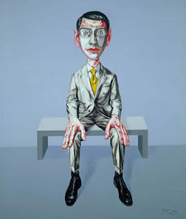
Between 1994 and 2001, Chinese artist Zeng Fanzhi painted his socially pertinent 'Mask' series, visualizing the ways in which humans interact and form relationships within the public sphere, and the imaginary masks people wear to conceal their private identity to conform to societal standards. Initially a means to express Fanzhi's personal emotional distress, the artist's 'Mask' series evolved into a socially-aware investigation of the "invisible barrier"[1] people erect to maintain distance between themselves and others. The subjects of Fanzhi's paintings don masks to shield themselves from social pressures and the constant negotiation between these expectations and personal identity. Fanzhi's masked characters "sacrifice emotional life for public conformity."[2] Painted with a strong expressionist style, the characters appear as almost idealized versions of a generic figure; they wear white masks that fit snugly over their faces, they dress in fashionable clothing (largely indistinguishable from one another), and stand in front of vibrantly bold colors whose flatness rejects any specific atmospheric interpretation.

 Mask Series #6, arguably one of Fanzhi's most famous paintings from this series, addresses these aforementioned characteristics, reinforcing the fabrication of relationships and the reduction of individual personalities to generic facades. Grouped together, the eight characters appear as if part of a performance. Fanzhi imbues the mask's ambiguity with cheerfulness and forced intimacy to emphasize the theme of the false facade. He arranges the characters in close proximity to each other to underscoring the psychological distance between them. Fanzhi enhances this sense of isolation in Mask Series #7 by positioning a well-dressed male alone on a bench in a similarly regulated scene. With the characters' true selves hidden behind their respective masks, these individuals appear, falsely, sociable and engaging.

The vogue yellow background of Mask Series #6—other paintings from the series display bright pink, pastel blue, and light tangerine backgrounds—indicates a vague, ultimately fictitious space; its starkness rejects any ties to reality. Its saturated all-overness supports the repetition of the masks to further accentuate the psychological tension between alienation and individuality that Fanzhi offers.

The red scarf, worn around the necks of many characters, functions as a symbol of honor and noble spirit, dating back to the Chinese Cultural Revolution. Fanzhi’s choice to incorporate these neck scarves signifies an internal emotional struggle that harkens back to childhood. When in school, Fanzhi was the only student in his class denied a necktie, an emotionally scarring event that tortured him into adulthood. For Fanzhi, this iconic red scarf simultaneously represents normalcy and social acceptance while limiting uniqueness and individualism. Another distinctive feature of Fanzhi’s paintings are his character’s unusually large hands. As evident in Mask Series #6, each character’s embracing hands, disproportionately large with exaggerated veins, communicate their personal and emotional traits.[3]

Zeng Fanzhi, Mask Series No. 6, 1996
Oil on canvas

Zeng Fanzhi, Mask Series No. 7, 2000
Oil on canvas


[1]Li Xianting, Zeng Fanzhi, exh. cat., (Shanghai, ShanghART Gallery, 1998). http://www.shanghartgallery.com/galleryarchive/texts/id/157
[2] Karen Smith, All That Meets the Eye: Zeng Fanzhi’s Art, 1990-2002, exh. cat., (Shanghai, ShanghART Gallery, 2003). http://www.shanghartgallery.com/galleryarchive/texts/id/162
[3] Karen Smith, Mask Series 1993-1998, exh. cat. (Shanghai, ShanghART Gallery, 2006). http://www.shanghartgallery.com/galleryarchive/texts/id/155